Sunday 6 November 2011

Finally, my deep depth of field images!

Taken randomly round my room at home, just trying it out. Was easy!

(ISO - 100) f22 3.2 Secs
(ISO - 3200) f22 1/3

(ISO - 3200) f22 1/3

(ISO - 3200) f22 1/3

(ISO - 2500) f22 1/3

(ISO - 3200) f22 1/3

(ISO - 3200) f22 1/3
The first thing I did was make sure the aperture was on a high number, I then made the shutter speed longer too, though some attempts (like the first) came out quite dark and the slow shutter speed made blurriness/camera shake more noticable. After this I raised the ISO number so that it would read more light, then I was able to speed up the shutter speed until it was at the correct exposure. 

Tuesday 1 November 2011

Product Studio Work

I chose to stick with the theme of music and carry it on to the product shots, I chose to photograph some plectrums by Dunlop. I wanted to use a mirror and a torch light in addition to the normal set up, to give it some difference.

Here are some of the photos:
(ISO - 200) f5.6 1/5
 For this one, it was my first try with the mirror, but I felt that the reflection distracts from the product itself, it was also too far out.
(ISO - 200) f5.6  0.8 Sec
 I went for a more generic close up using no mirror, this worked well, but as it looks almost quite like a snap shop I feel I would have to edit this a bit if I were to use it.
(ISO - 200) f5.6  0.8 Sec
This is one of my favourites, I love the lighting, I love the way the blur of my hand looks like fire and my bracelet dangling gives it that sparkle in there! It's a shame that the product name isn't clear on this though. 

(ISO - 200) f5.6  0.8 Sec
I feel that the glow of the light works better here, you can see the product name which is very important, however the framing is slightly off and I feel that cropping it would ruin the effect of the light; it would cut off the circular shapes.
(ISO - 200) f5.6  0.8 Sec
 The light effect here looks wispy and it looks almost like gas! I really like this effect, I didn't really imagine what I would exactly do with the torch light, but this is certainly effective!
(ISO - 200) f5.6  1.6 Sec
 I like this one because it's got a perfect distance to read the brand name and there is an interesting dramatic light, it's almost like stage lighting in a way and the material could even represent the lining inside a guitar case.
(ISO - 200) f5.6  1.6 Sec
This represents the same as above but the artificial lighting brings out a big difference, it's more of a graphical look to the photo and could have text overlayed onto it.

I have not edited any of these images as I feel that they look fine as they are :)

Monday 31 October 2011

Carrie Notari

I was about to turn the page in the Light and Lens book when I spotted an incredible photo, it was by Carrie Notari.

I decided to check out some of her work:


I love anything that is montage, so finding this has completely opened up my views on it even more.

I love the way she has overlayed pictures of bark over top of the portraits of faces and body parts, the texture combination is very interesting to look at, it's surreal.

Reading more of light and lens.

There is a paragraph that is very true and quite motivating.
On page 290 - Light and Lens: Photography in the digital age.

It says that when you walk down a street, you don't see anything but making sure you're not about to trip up or something, you take no notice of your surroundings. But to be truly inspired, you must have an open mind, explore, see, look and be aware of everything. 

That the method of working should consist of composing the viewpoint and the lighting inside the frame, then you ask questions to yourself, you answer them in the frame. You think about it all independently, perhaps influences run through your mind but you must never feel the need to compete or envy someone else's work and only use parts of someone else's ideas if you work that way, never directly copy because it's not your idea at all. 

Very true words, I have always worked this way, I will continue to do so as it works for me.

My Studio Portraits.

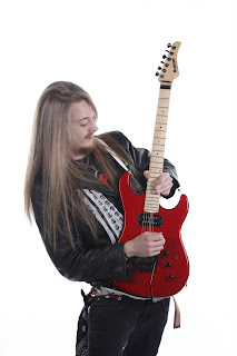
My passion is not only photography, but it's music too. I chose to photograph a couple of musicians for their profiles in use, to be used to promote them. I was going for a kerrang! style client. My first shoot was high key, the second was less high key but not quite low key. I used Rembrandt lighting at the front with a fill light. The hi key photoshoot had 2 bowens lights with umbrellas to spread the light onto the background. The second photoshoot had one bowens light with a reflector at the back to create a Rim light around the subject.

Here are some of the images from the first shoot:


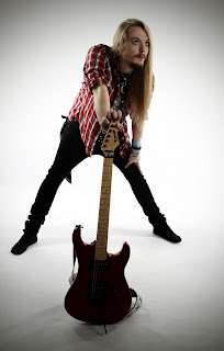
All (ISO - 100) f8 1/100 - they have been edited.
Here is the technique I have used for editing these images:
Original Image
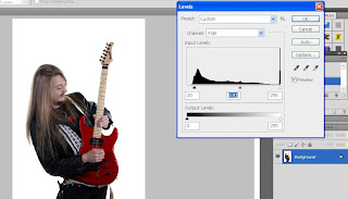
Image > Adjustments > Levels
Levels can adjust the shadows, highlights and midtones. Here, I changed it so that it appeared more darker in the midtones and shadows as the original was slightly on the bright side.

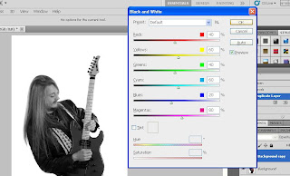
Ctrl+Alt+Shift+B OR Image > Adjustments > Black + White
I created a new layer and changed this to black and white.

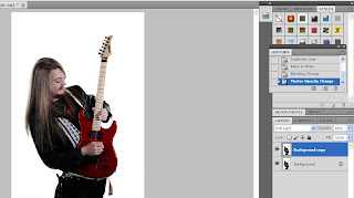
Blending layer turned into 'Soft Light' and opacity set at 68%
This layer makes the contrast more punchy and the colours have more tone in them, I had to reduce the opacity so that it wasn't too overpowering in contrast as it didn't show as much detail in the image if it was kept at 100%.

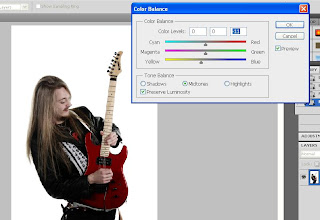
Image > Adjustments > Color Balance
After I had flattened the layers, I went onto the color balance adjustments to bring out the yellow tones for the blonde in the guitarists hair as I felt the black and white additional tones had lost the colour coming through.

Using the spot healing tool, the one that looks like a plaster.
I got rid of the odd spot here and there to make the skin appear a bit better. In previous photos I've had to use the clone tool to even out the skin tone beneath the eyes in certain angles that he was in as those areas appeared darker than they do here, making him look as tired as he was!

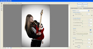
Filter > Lens Correction > Custom then Darken the Vignette
To add a bit of framing and tone on the white background, I thought I would add a vignette round the edges. This has always been a habit for me ever since I learnt how to use it, in some cases it can look too much so I've learnt to use it wisely, but this adds a powerful effect I feel as it puts the attention on the guitarist just that bit more. Oh and lastly I had to click 'Ok' and flatten the layer as it turns into a floating layer.

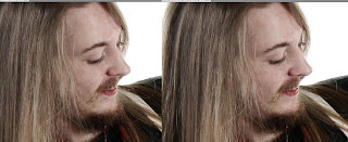
So there you have it, a before and after:
Before

After
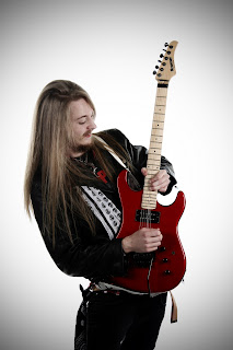
Here are some of the images from the second shoot:


All the settings and editing techniques were the same for these photos. 
I would love to do this type of shoot again, this is one of the things I would like to do as a career, to take photographs of musicians because I would like my interests combined.

Sunday 30 October 2011

Light Painting Again

I tried another attempt at home to do some light painting, I got my housemates to wave a torch around in the kitchen with all the lights switched off.

(ISO - 100) f5.6 0.8 Sec
This appears evidently too short in time, but they stopped waving the torch too early and I framed it too off.

(ISO - 100) f5.6 1/5
After adjusting the timing to a time that had worked well in the studio, this was the result. I find it quite tonal but it was out of focus, which always has been a problem since I've tried it at home.

(ISO - 100) f5.6 1/8
This was more improved, less time so that there was less of the fuzzy glow, the torch was in focus and I had rested the camera on a pile of catalogues on the table..I still know I need a tripod for this exercise! But I am pleased with this result, it's the best one of the lot.

(ISO - 100) f5.6 1/8
They had accidently knocked open the curtains, however, I am rather impressed by the effect it made! It looks like fire almost because of the orange glow! 

(ISO - 100) f5.6 1/8
Here is another attempt at this 'fire' effect, this time I waved the camera around aswell as the torch being waved around. I feel that it would be better if there had been a particular shape drawn.

(ISO - 100) f3.5 1/4
I wanted to light up my housemate and have shapes drawn around them, at first, I thought their laptop would light them up, I changed the shutter speed and aperture too. This didn't work because the laptop light wasn't bright enough, I needed a flash.

(ISO - 100) f3.5 1/13
I used the flash this time round, shortened the time when I should have left it or rose the aperture, but I think the results show that they worked quite well this way, the blurriness could have been resolved with a tripod though!

I'd be quite happy to try these out outside one day to involve a landscape inside the frame too.